

NO. 085 · sightedlogged 2025
THE MOVING ORGANISM
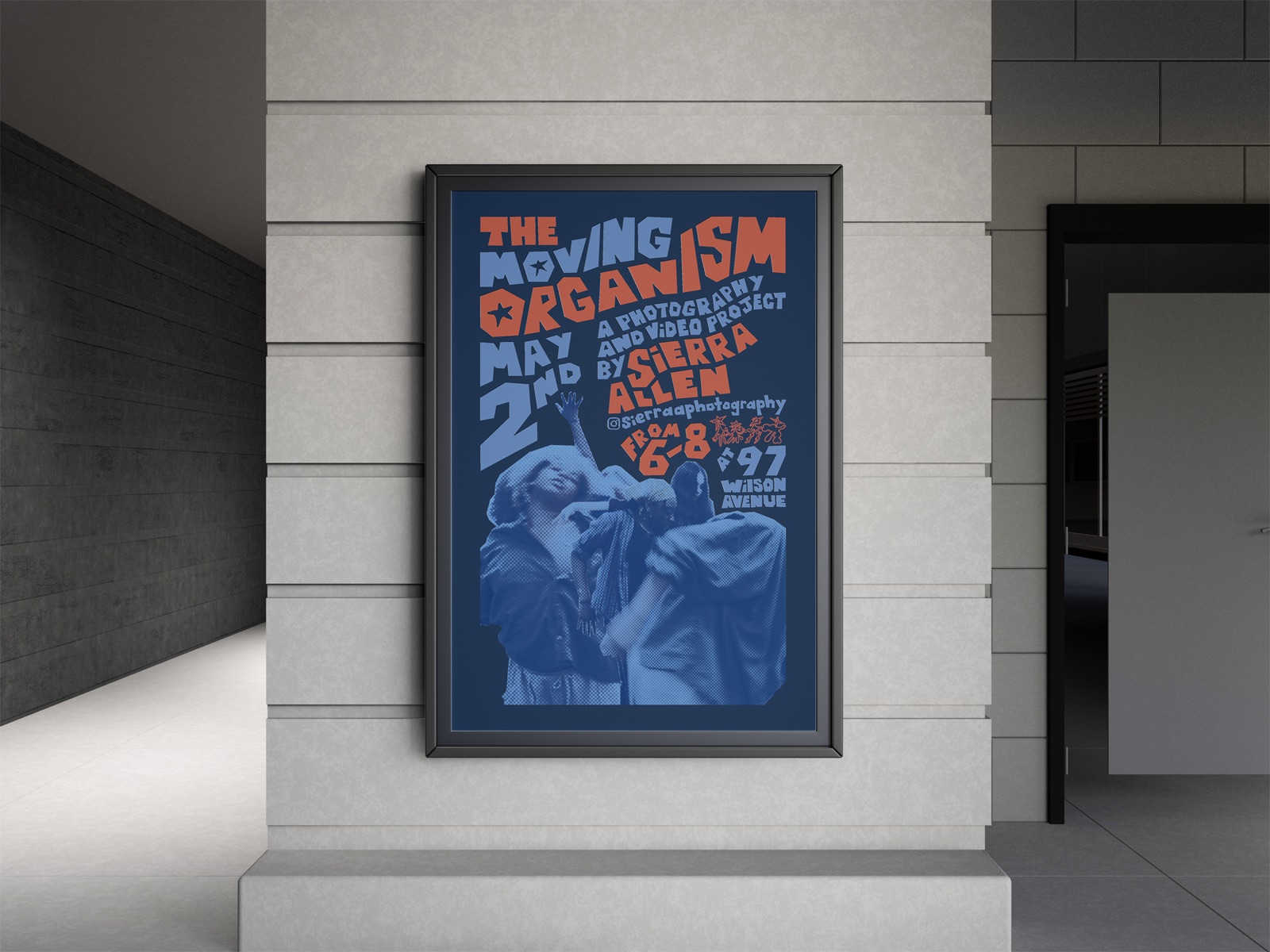
The whole story: first direction, decisions and all.The short version, focused on the finished work.
OVERVIEW
What is it?
An exhibition identity for The Moving Organism, photographer Sierra Allen’s series celebrating dancers captured in their natural elements.
- Project
- The Moving Organism
- Client
- Sierra Allen
- Type
- Graphic Design / Brand Identity / Event Promotion
- Role
- Visual Identity, Print & Social Design, Merchandise
- Tools
- Lightroom, Photoshop, Illustrator
- Timeline
- 5 weeks
THE BRIEF
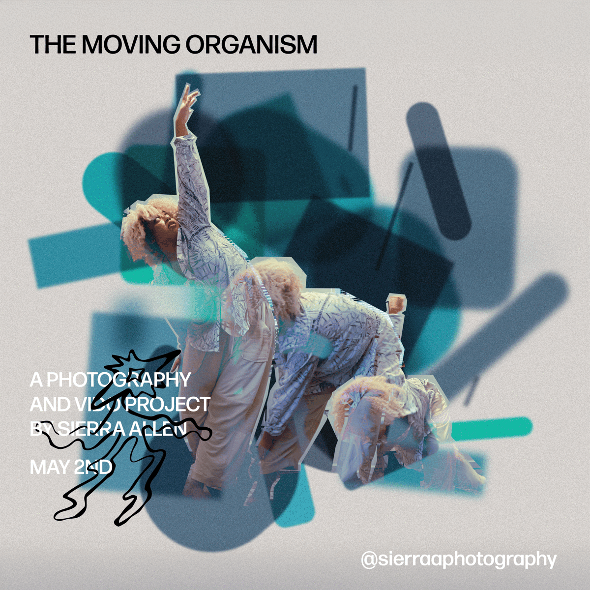
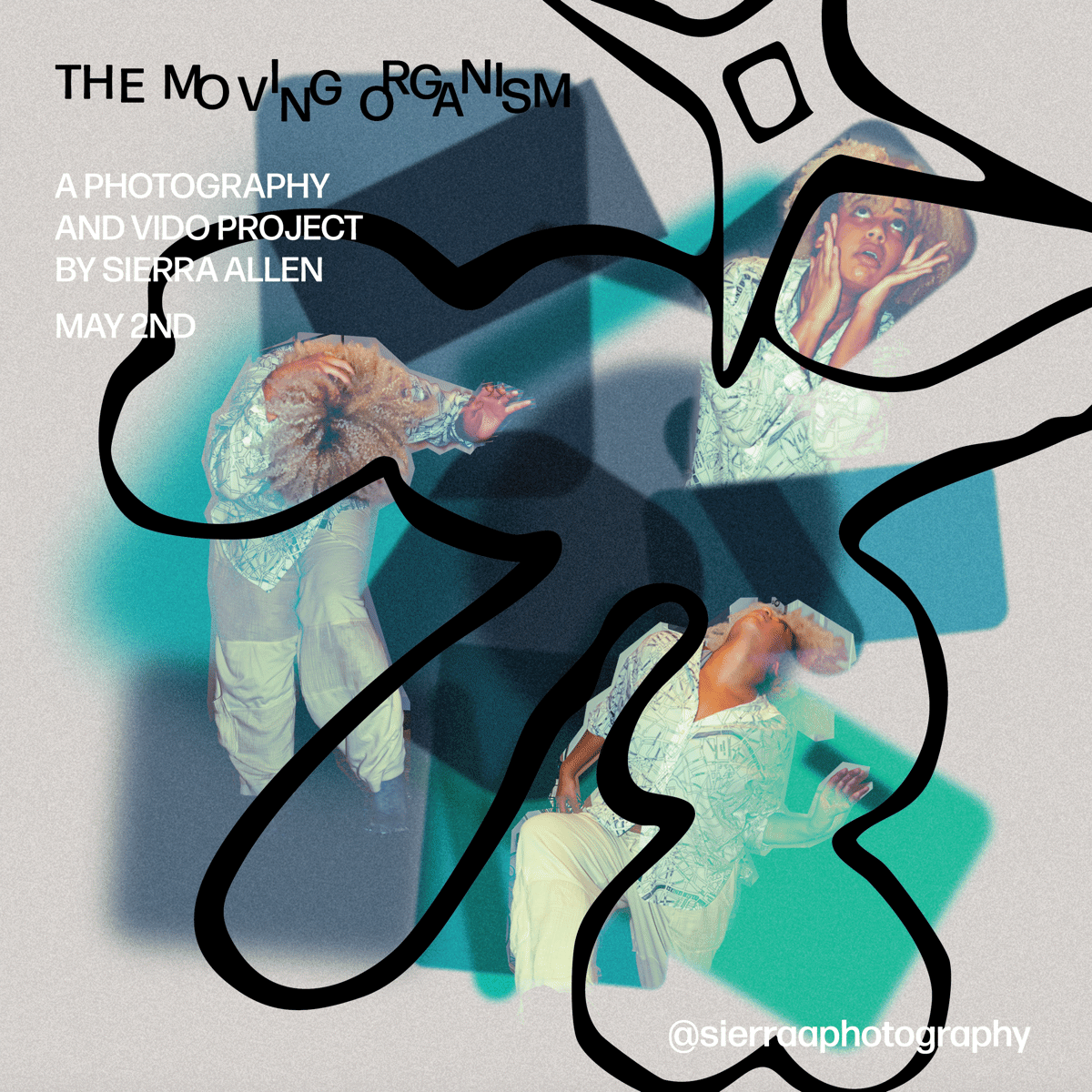
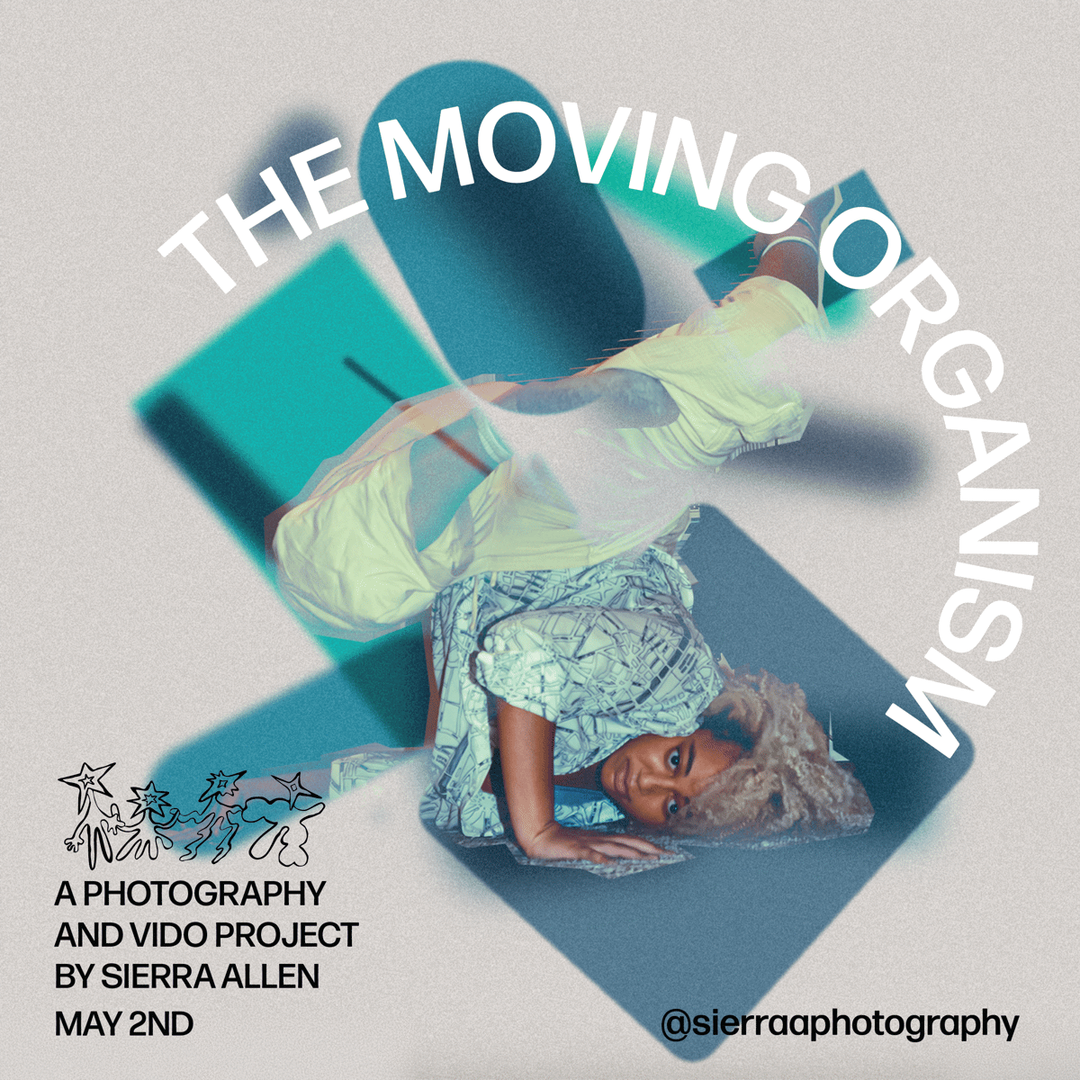
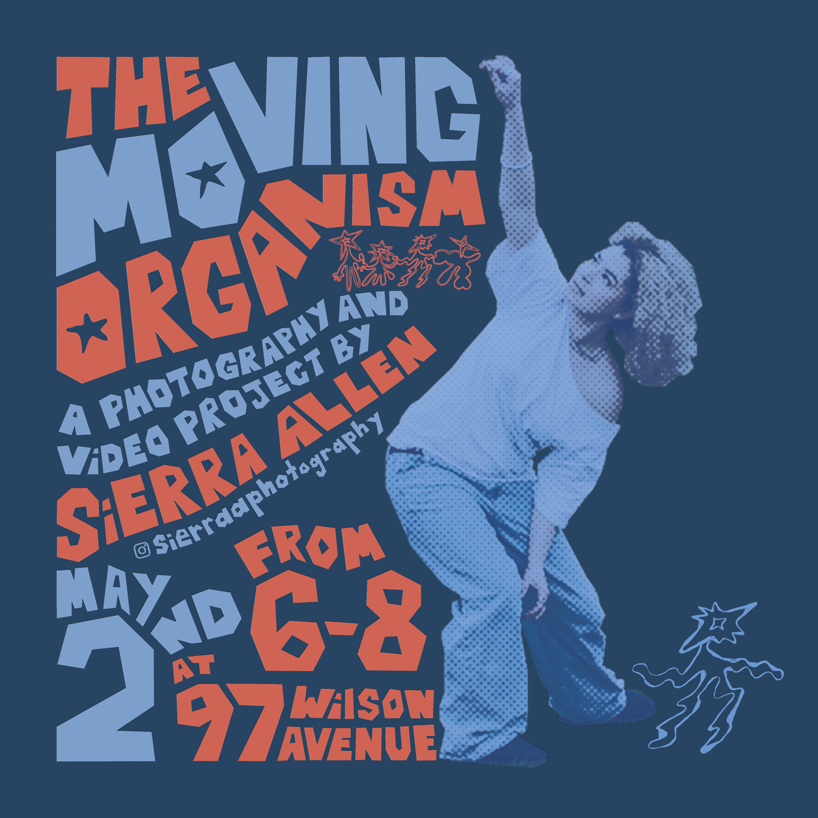
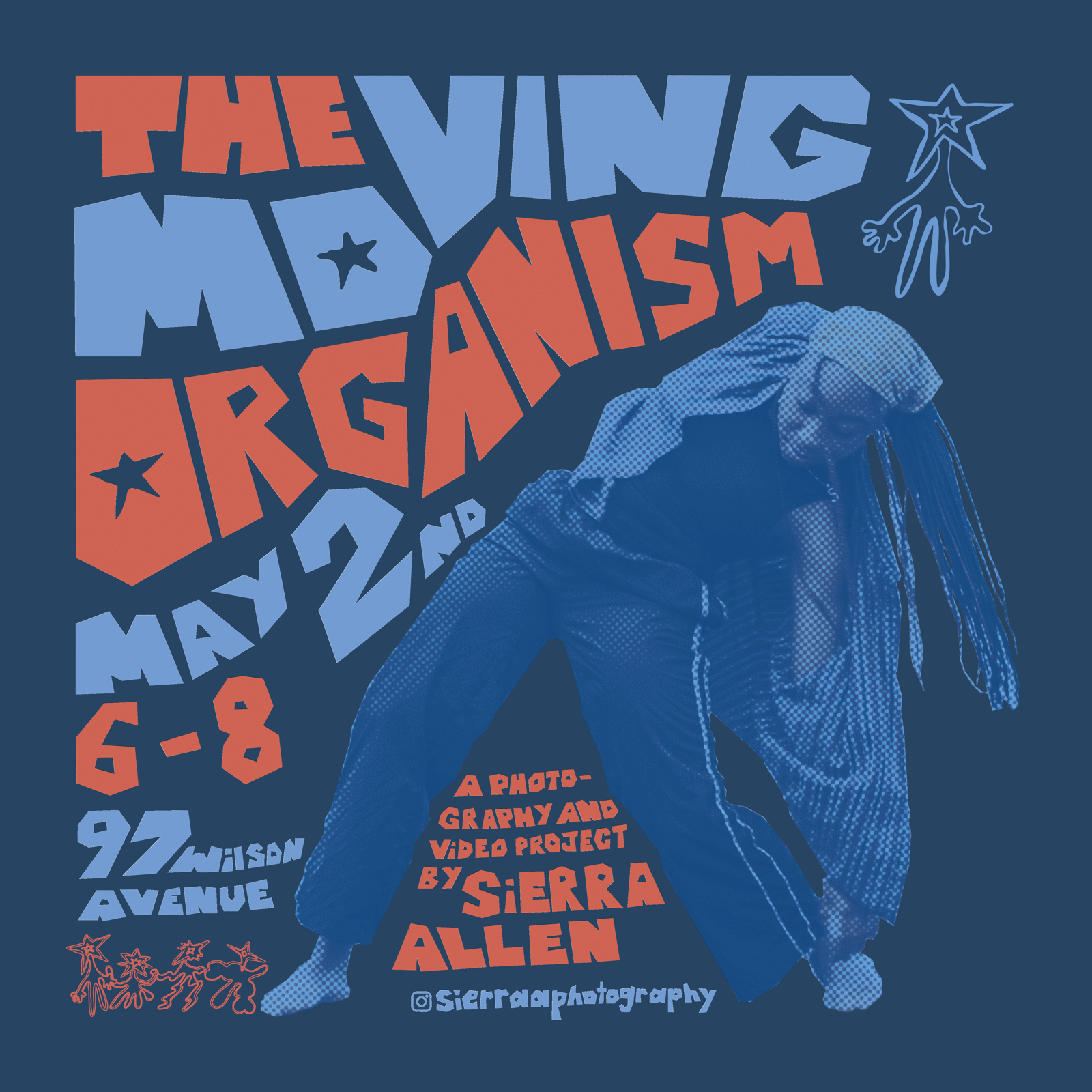
Sierra needed promotional materials to carry her exhibition across print and social media. I designed a set of posters, coordinated Instagram graphics and event merchandise, all built to highlight the energy, form and individuality in her photographs.
APPROACH
What was the brief, and what design decisions did I make?
- The brief
- Promote Sierra’s exhibition across print and social media, highlighting the energy, form and individuality in her photographs.
- Design decisions
-
Collage as the concept
Custom lettering that looks cut from construction paper, inspired by Sierra’s love of collage.
Type that moves with the dancers
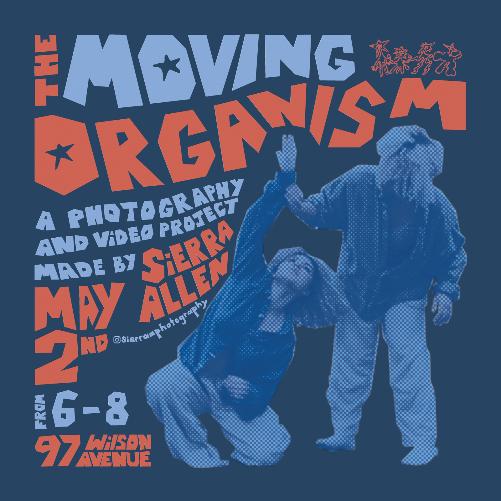
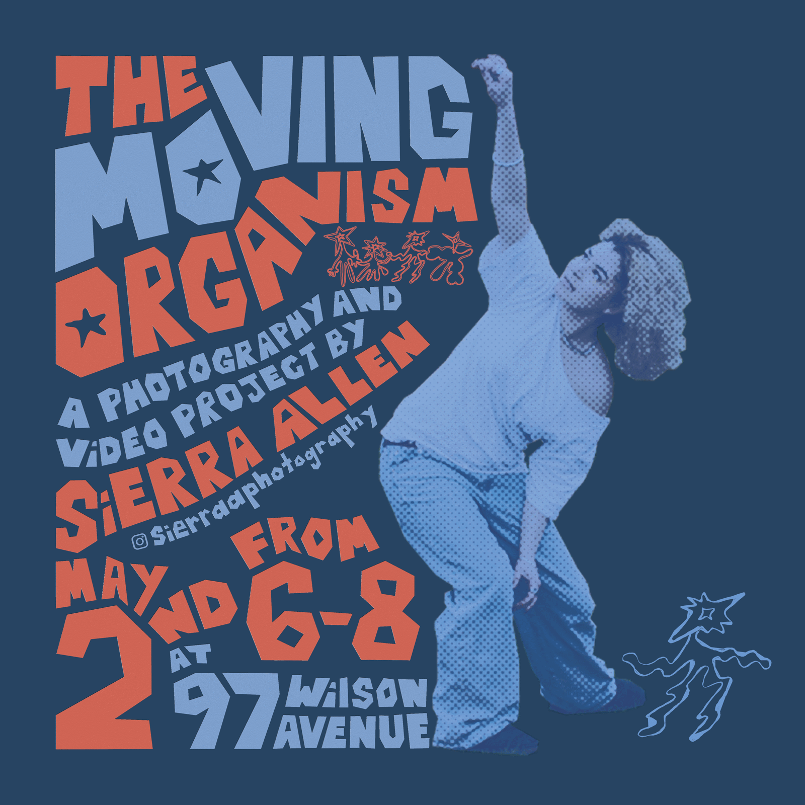
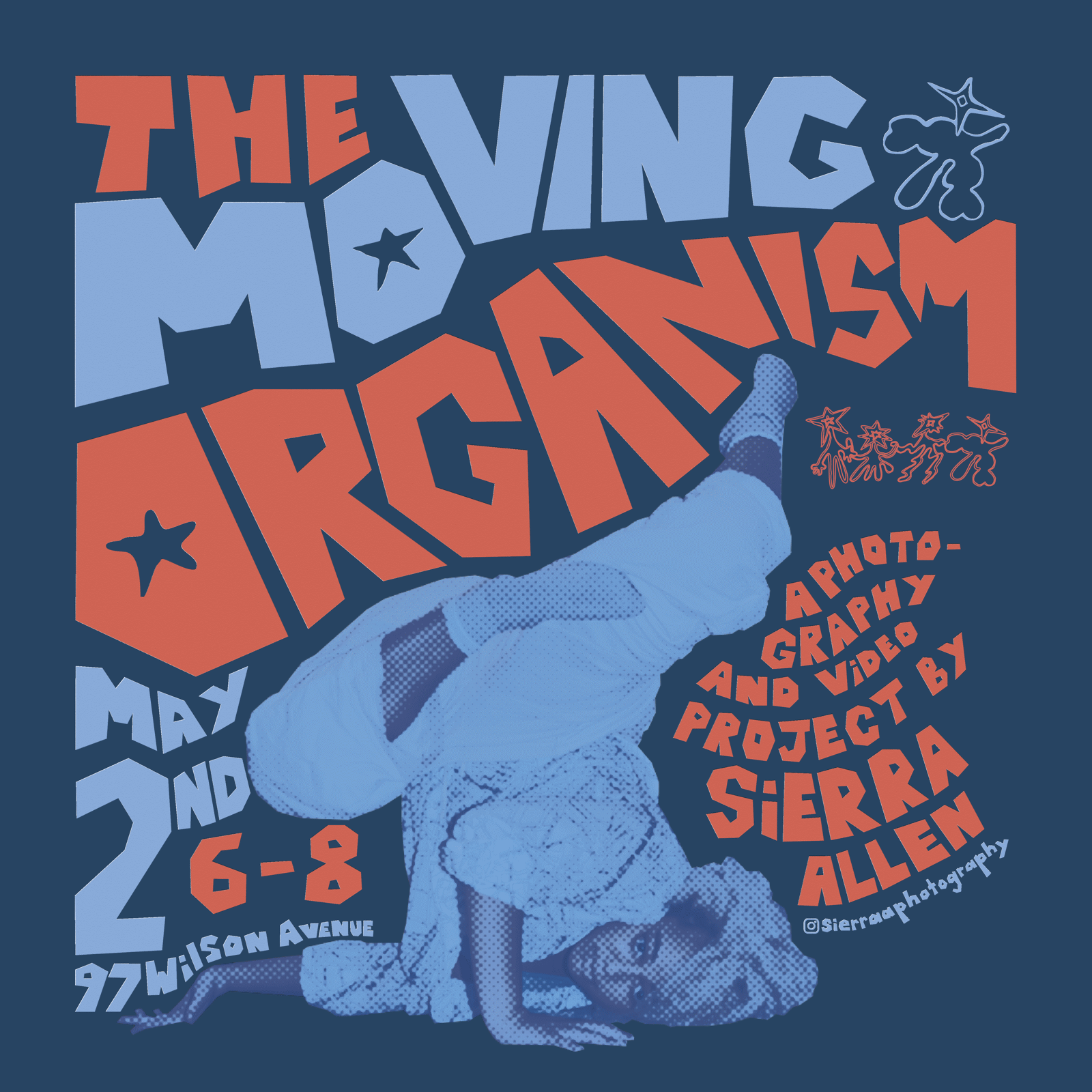
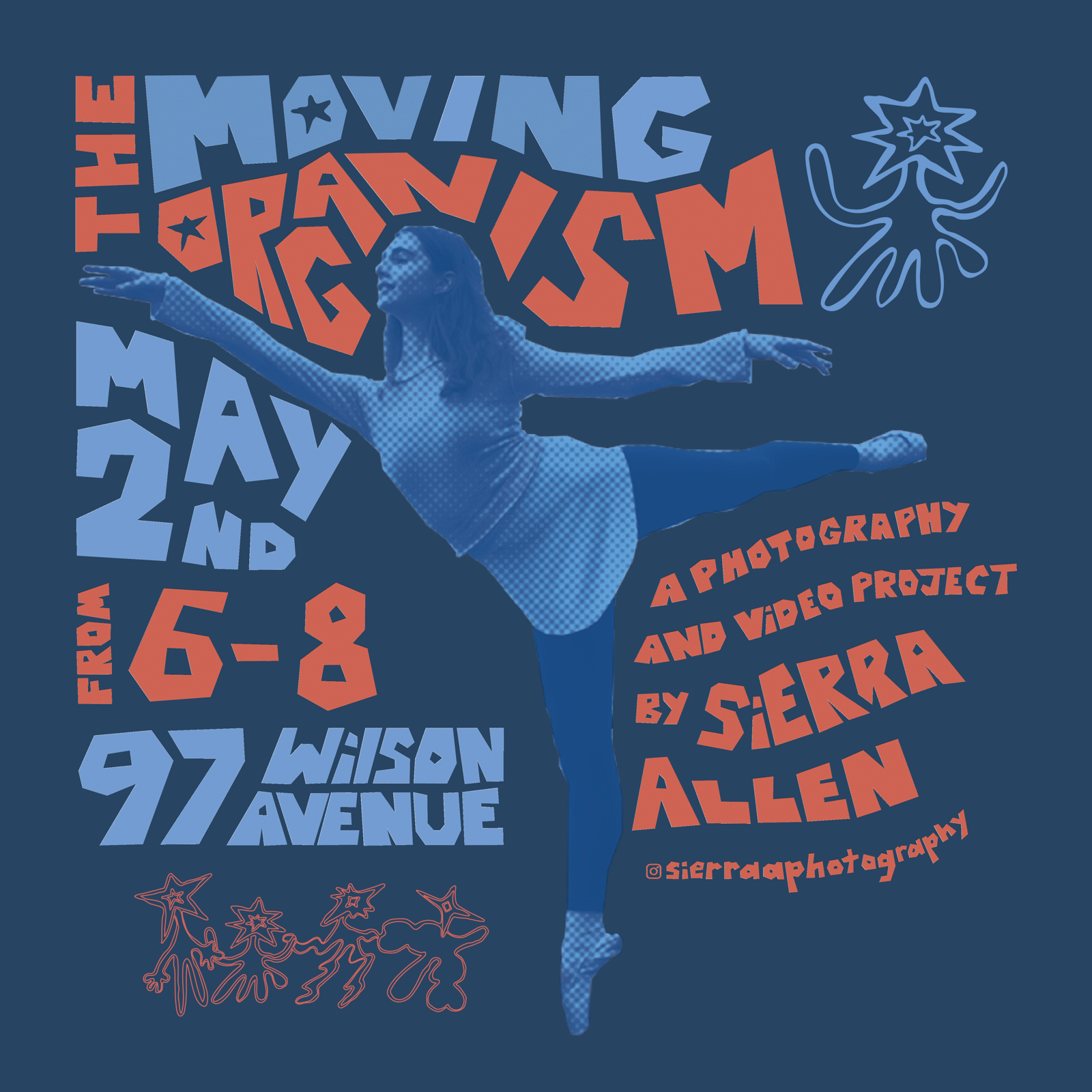
The letterforms bend around the dancers’ outlines, carrying the same movement as the bodies they surround.
Halftone for energy
Monochrome halftone photos add a printed, tactile contrast that pairs with the paper-cut type.
IDENTITY
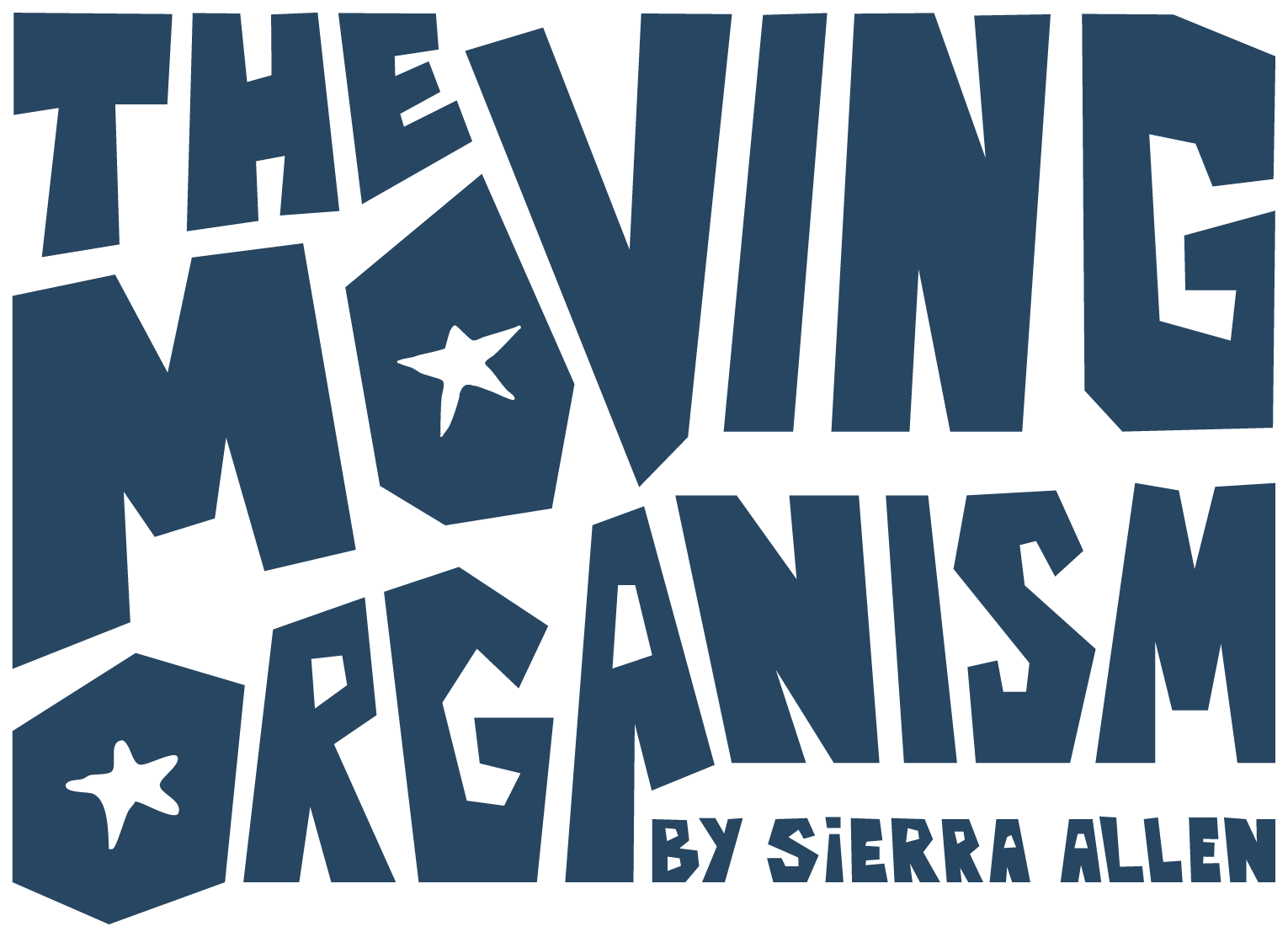
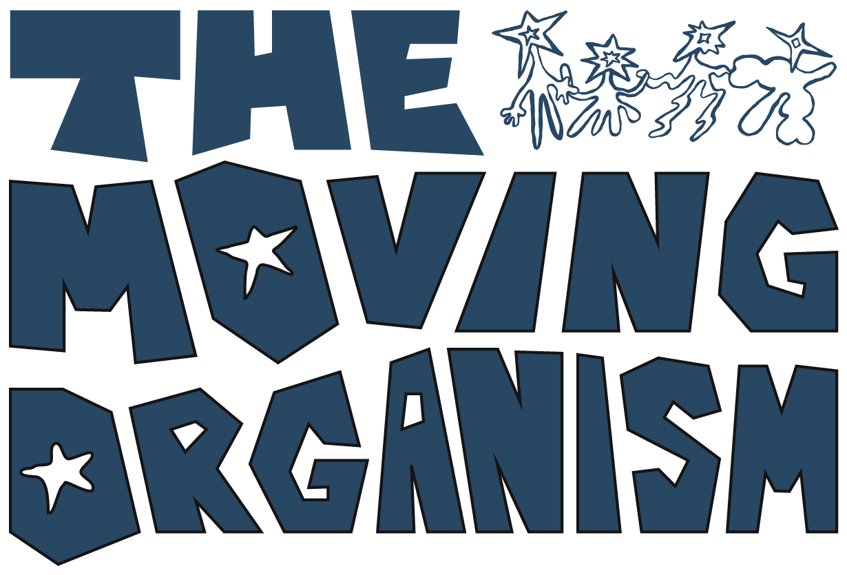
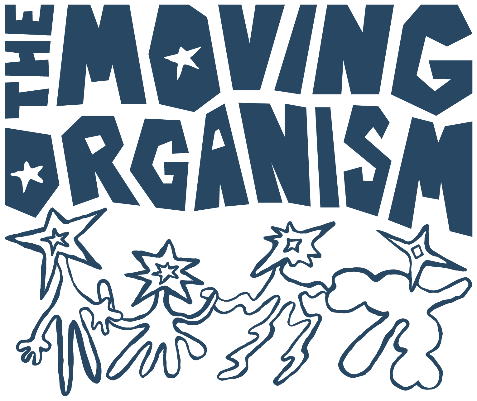
Five lockups, one system.
SOCIAL
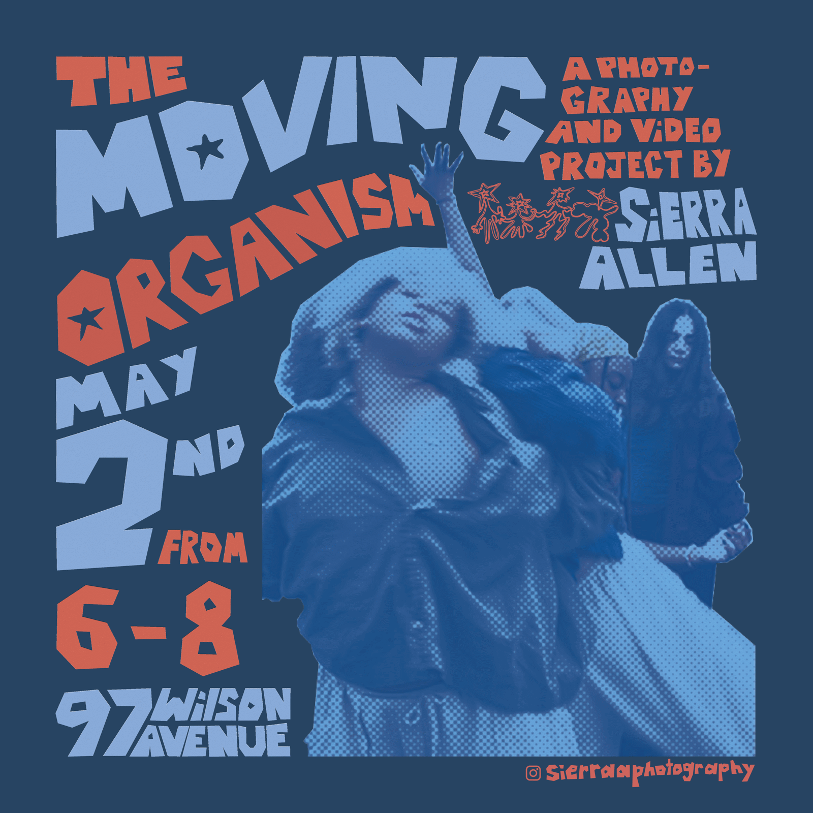
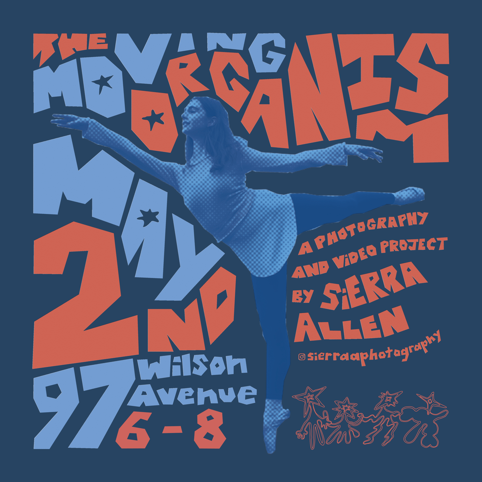
Click any post to flip through all eight.
BEYOND THE BRIEF
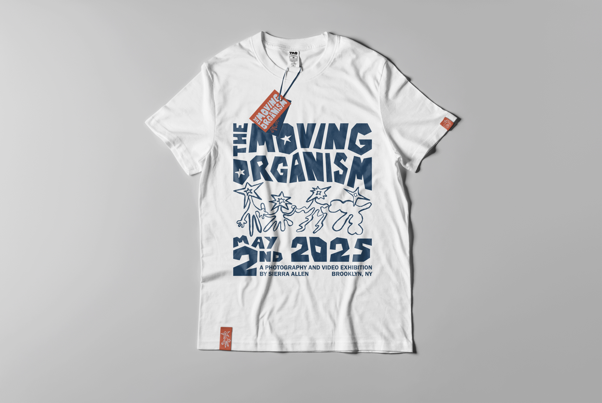
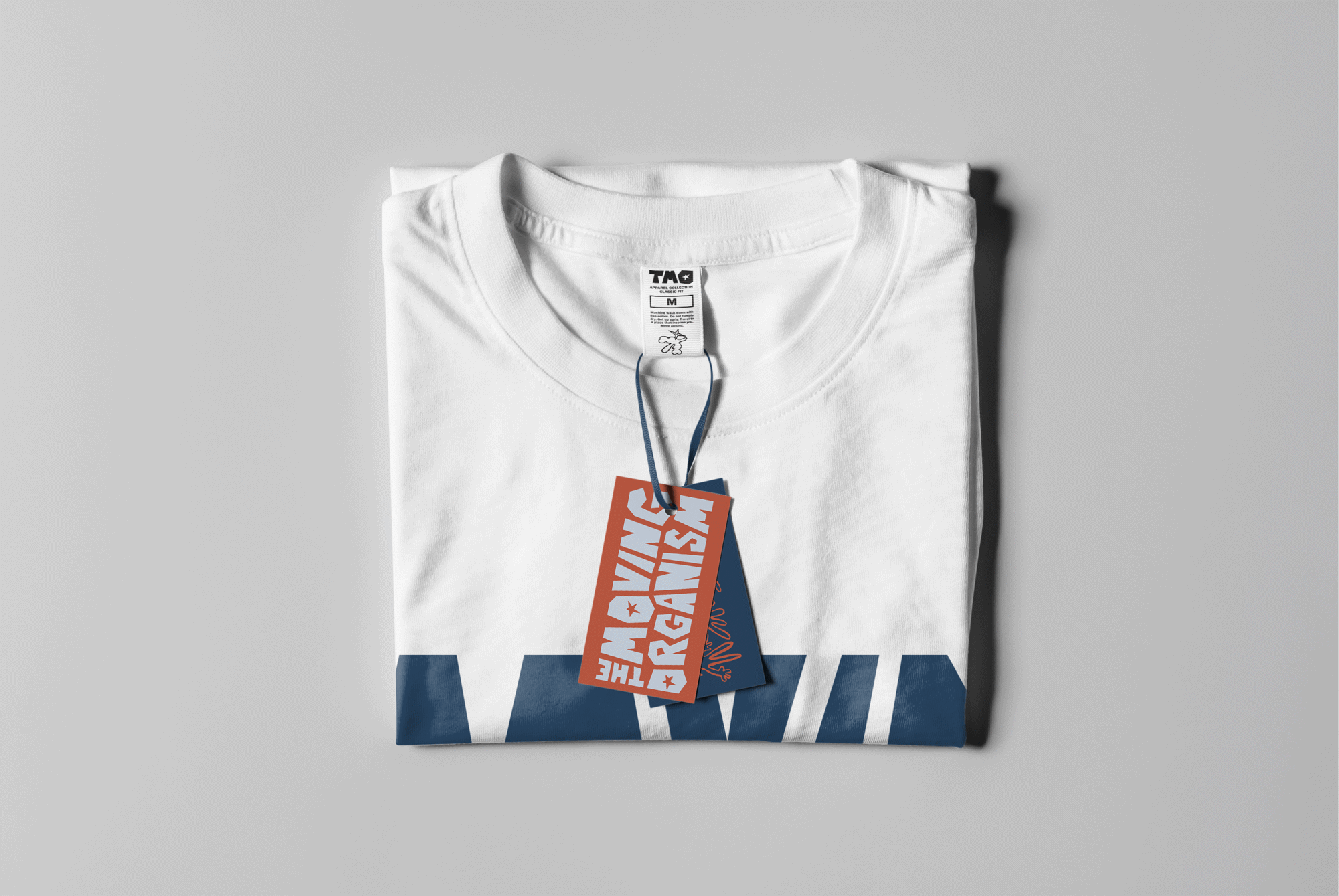
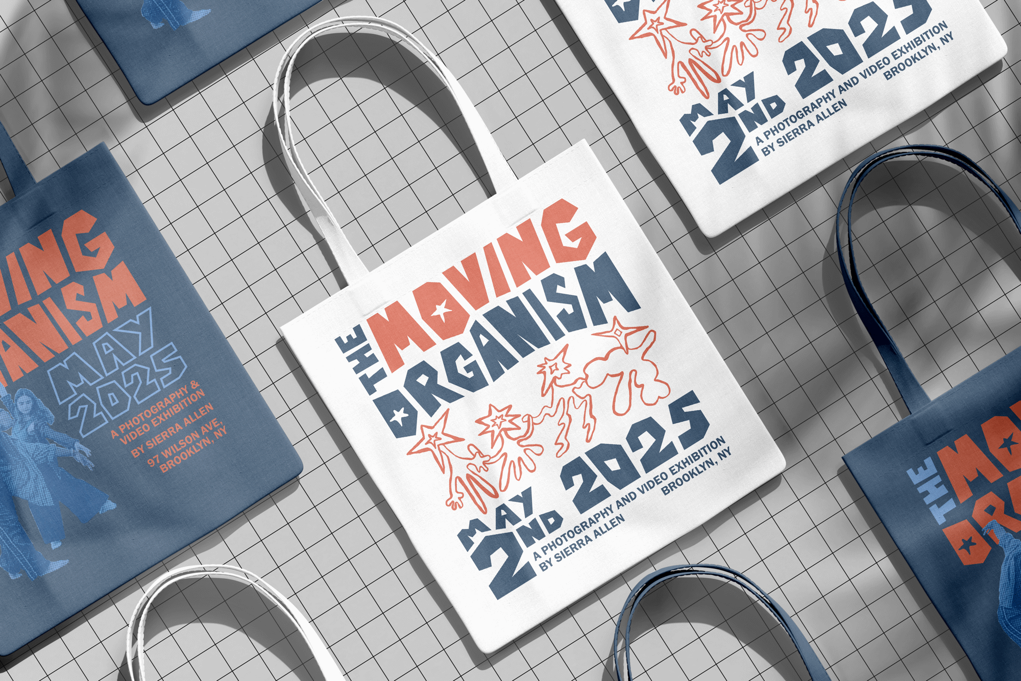
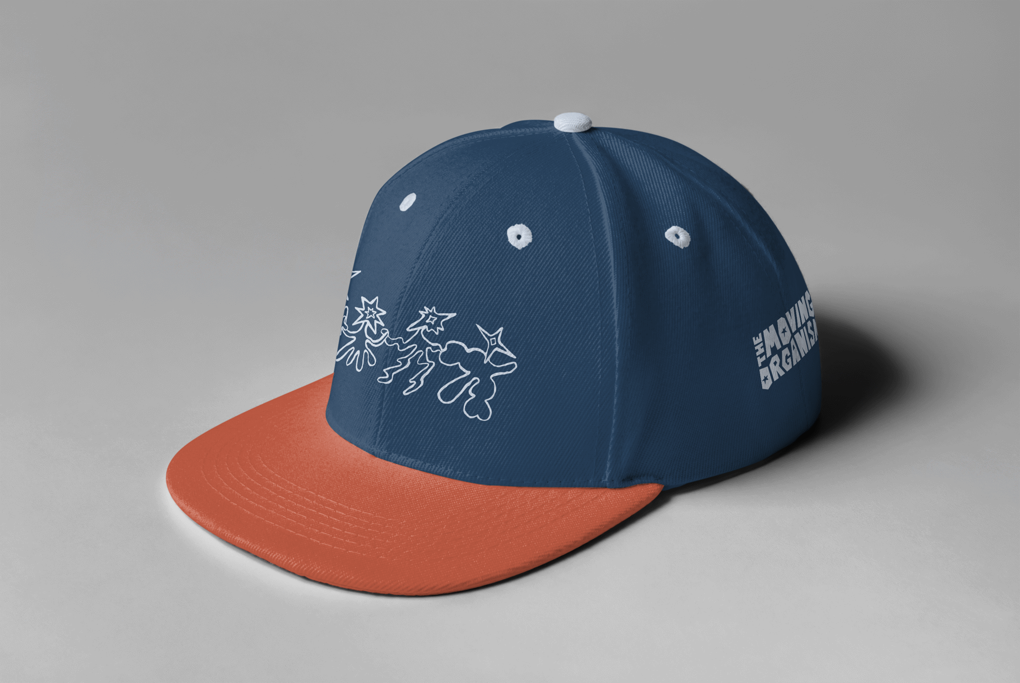
The brief stopped at posters and social media, but I wanted to see how far the identity could stretch, so I carried it onto apparel, totes and a hat.
DESIGN DECISIONS
Collage as the concept
Sierra kept coming back to collage, so I designed custom lettering that looks cut from construction paper: chunky, oversized and a little imperfect, the way a hand-cut shape would be.
Type that moves with the dancers
Instead of setting text beside the photos, I shaped the letterforms around them. They bend and give way to the dancers’ outlines, so the type carries the same movement as the bodies it surrounds.
Halftone for energy
With full creative freedom over the photos, I turned them into monochrome halftones. The contrast gives them a printed, tactile texture that pairs with the paper-cut type, and Sierra liked it enough to ask me to push it further.
REFLECTION
What did I learn?
Designing for another artist’s work meant my job was to frame her photographs, not compete with them. Client feedback pushed me past a quiet first direction into something much bolder, and taking the identity further than the brief asked showed me how well a system holds up once it moves off the screen and onto real objects.